Better Neighborhood Experiences
Nextdoor is where communities come together to greet newcomers, exchange recommendations, and read the latest local news. Where neighbors support local businesses and get updates from public agencies. Where neighbors borrow tools and sell couches. It's how to get the most out of everything nearby.
- Branding
- Product Design
- User Experience
Tools
- Figma
- Adobe CC
Date
October 2021
Intro
Nextdoor is a unique platform for communities to come together. Unlike the name, Nextdoor does not only let you interact with your next-door neighbors but also nearby micro-communities.
In moving to a new neighborhood, my wife and I used Nextdoor to get to know the community and the general area better. As a user, I noticed many opportunities to enhance the product. The overall concept of Nextdoor is great, however, just like many other users, we found that the overall user experience can be improved.
This case study seeks to address issues and enhance the experience, as well as introduce a new Services functionality to the Nextdoor app.
Branding
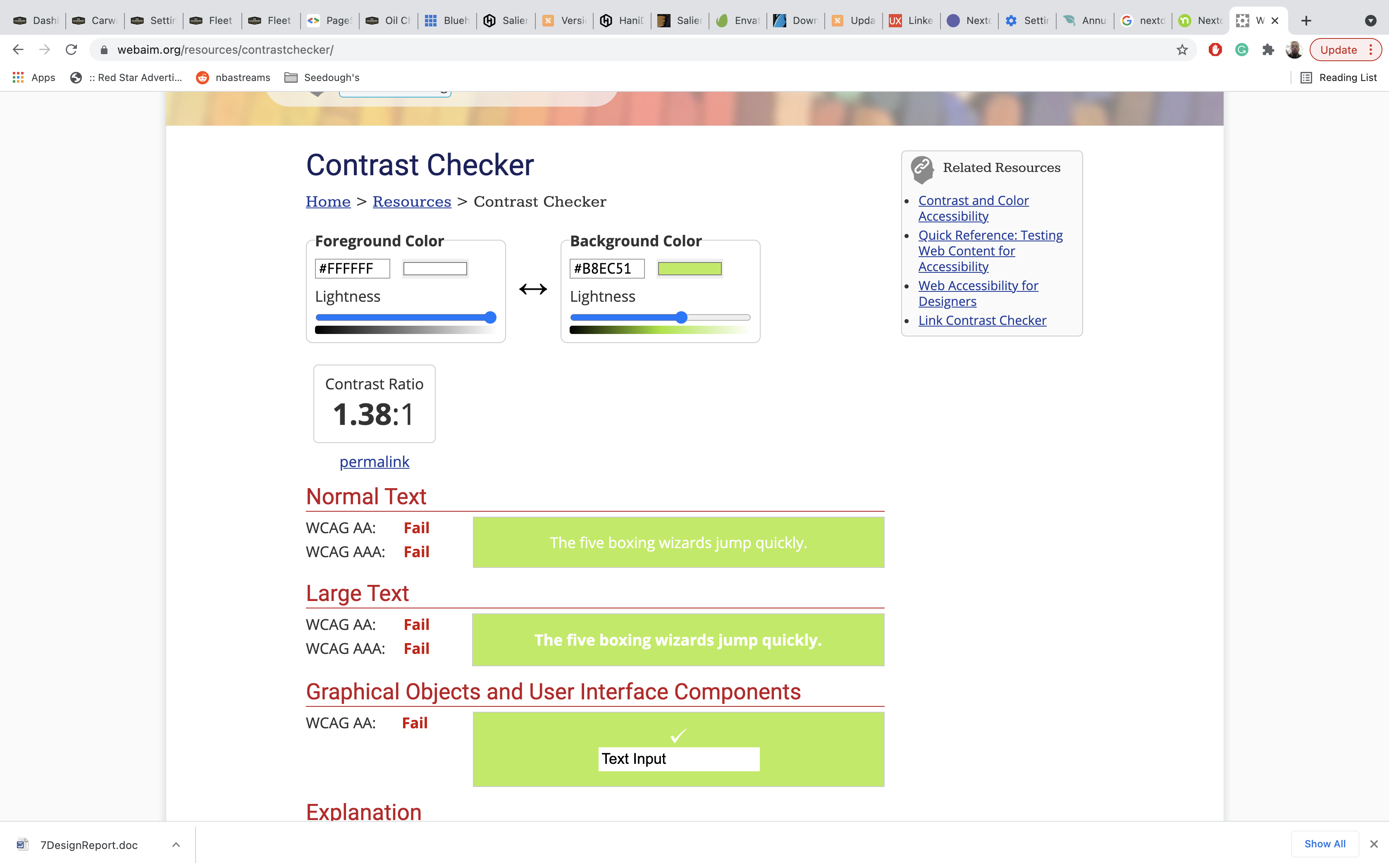
One issue that stuck out to me immediately when working on this case study is Nextdoor’s branding mistake. While I do agree that the colors used are different, relevant to a typical neighbor persona, the color usage did not always meet accessibility standards. This is mostly in reference to the usage of Lawn Green (#8DD400).
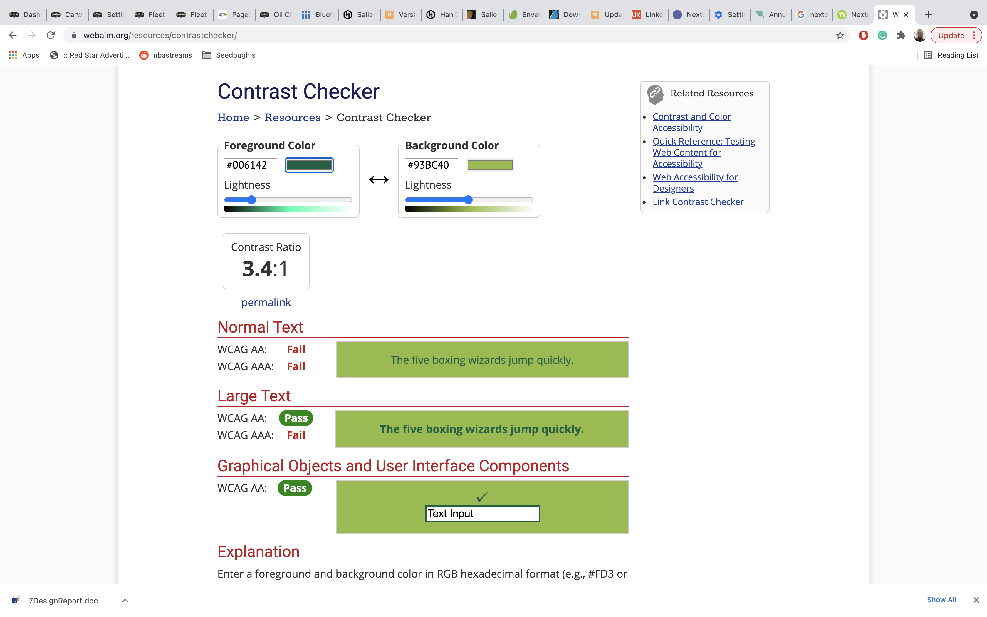
Using an accessibility tool to measure the contrast, we find that it fails when combining Lawn Green sits on the background or foreground of the color white. This seems to be a rebranding mistake from Nextdoor’s original Dark Cyan (#006142). Interestingly enough, as Nextdoor has demonstrated throughout the app, Dark Cyan in bold text with a Lawn Green background seems to solve this problem.
Accessibility Tests
Using an accessibility tool to measure the contrast, we find that it fails when combining Lawn Green sits on the background or foreground of the color white. This seems to be a rebranding mistake from Nextdoor’s original Dark Cyan (#006142). Interestingly enough, as Nextdoor has demonstrated throughout the app, Dark Cyan in bold text with a Lawn Green background seems to solve this problem.
Branding Alternatives
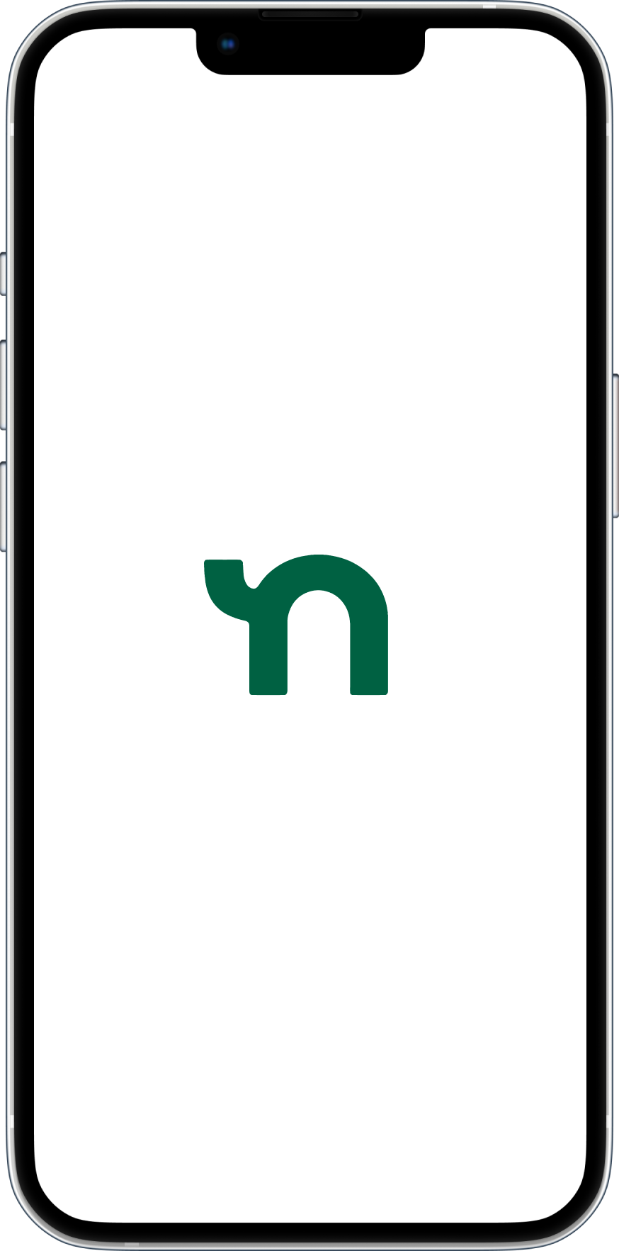
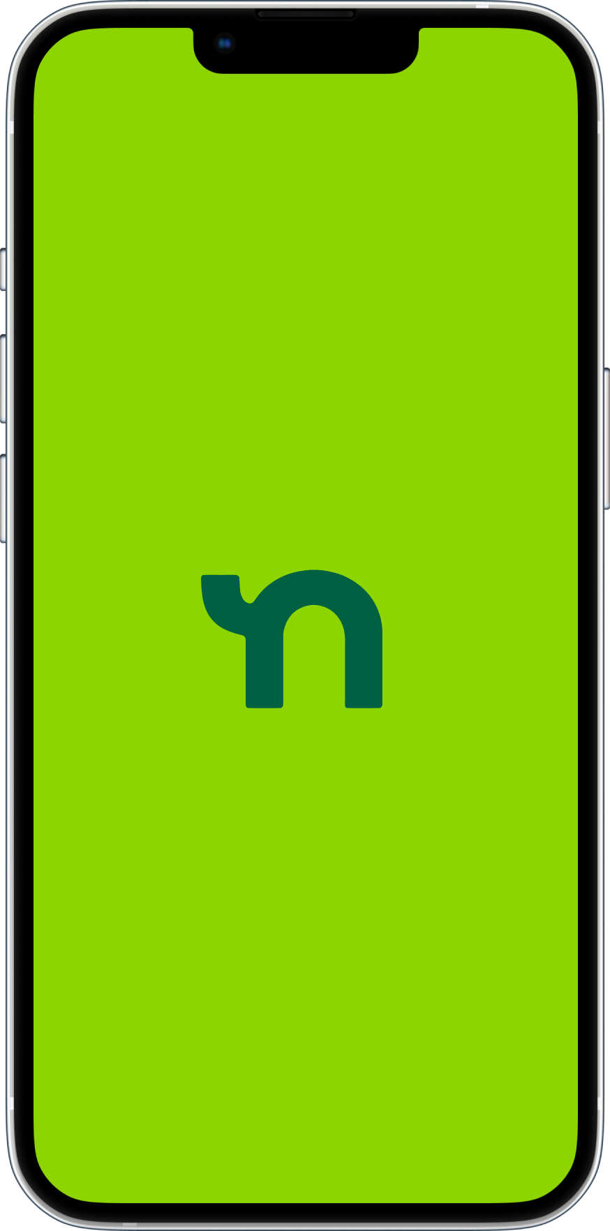
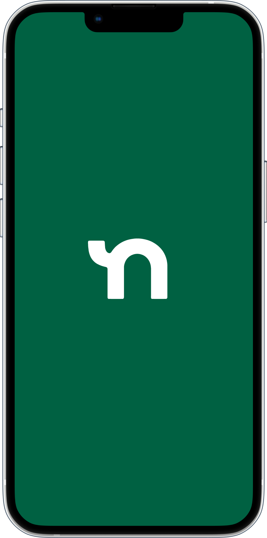
Utilizing the Dark Cyan helps us improve accessibility as well as retain some brand recognition. The Dark Cyan can be used on white background and foreground. In this case study, my recommendation to Nextdoor would make Dark Cyan the primary color and Lawn Green the secondary color in the brand pallet for Nextdoor. Above are some examples of what this could look like.
Utilizing the Dark Cyan helps us improve accessibility as well as retain some brand recognition. The Dark Cyan can be used on white background and foreground. In this case study, my recommendation to Nextdoor would make Dark Cyan the primary color and Lawn Green the secondary color in the brand pallet for Nextdoor. Above are some examples of what this could look like.
Product Design
The Nextdoor product is amazing, it helps bridge the gap of communication with neighbors even with the busy lives we lead. As a relatively new product on the market, it is expected that user experience and product enhancements will only improve.
This section will cover recommendations for general improvements to the user interface – translating into a better user experience and the introduction to Services a unique business opportunity for users, or in this case, neighbors.
Home Screen
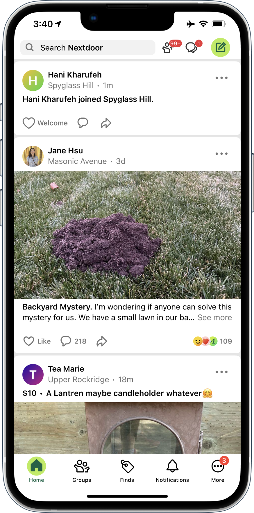
The Nextdoor home screen in my humble opinion has the greatest opportunity to improve user experience. It is the first impression of any new user exposed to the app.
Opportunities
1. Search
In attempting to diagnose the anatomy of the app, Search stood out to take too much Real Estate. In terms of eye-tracking and overall hierarchy, we can assume it is too much prominence for an action that can be called to action the same way with less real estate.
2. Navigation Icons
The navigation icons next to Search are constricted, attributing to a cluttered and overwhelming experience. While messaging and creating a post have hierarchical merit, connections do not meet the same hierarchical standard. This case study will seek to create a better experience for navigation entirely.
3. Padding
Another thing that stands out when examining the home screen on Nextdoor is padding. The padding between cards, much like the navigation icons and search in the header attribute to constricted impression. This gives the user a sense that there is too much going on. In a persona exercise, I discovered that the dominant Nextdoor user is typically a homeowner. Homeowners tend to be older and not being able to automize the distinction between topics can lead to poor usability reports from principle users.
4. Services
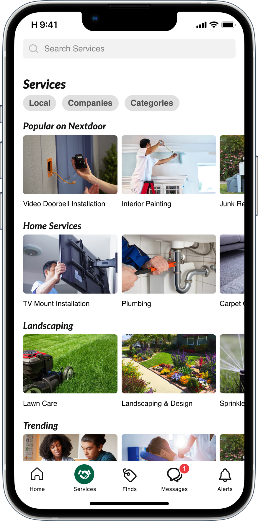
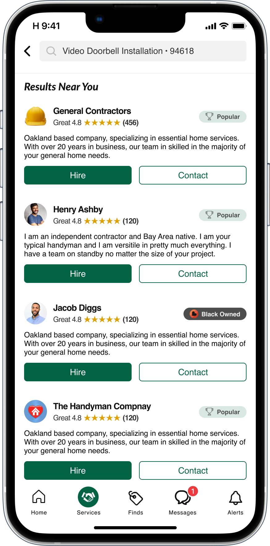
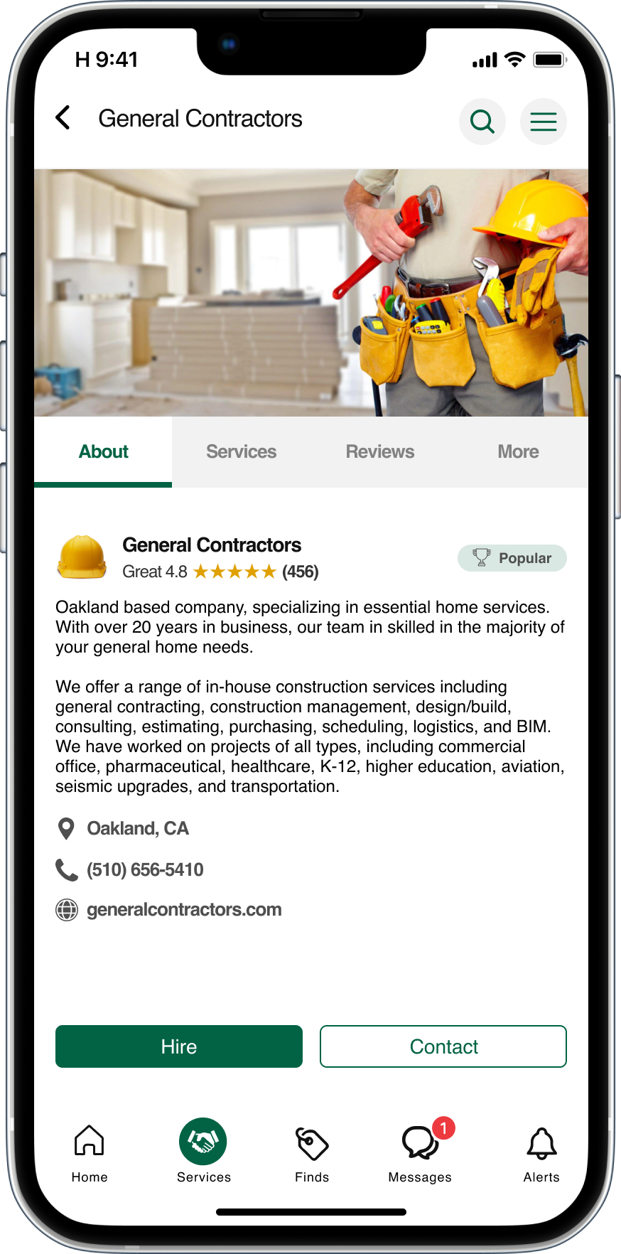
As I moved to a new location, one idea that came to mind is seeking essential home services on Nextdoor. To my surprise, I did not find such listings on Nextdoor and it seemed to be a missed opportunity. In this case study, I have taken a shot at visualizing how this product addon may work.
5. Primary Navigation
The floating primary navigation will be reimagined in this case study as part of a hierarchal study that will relocate some of the functionality.

Proposal
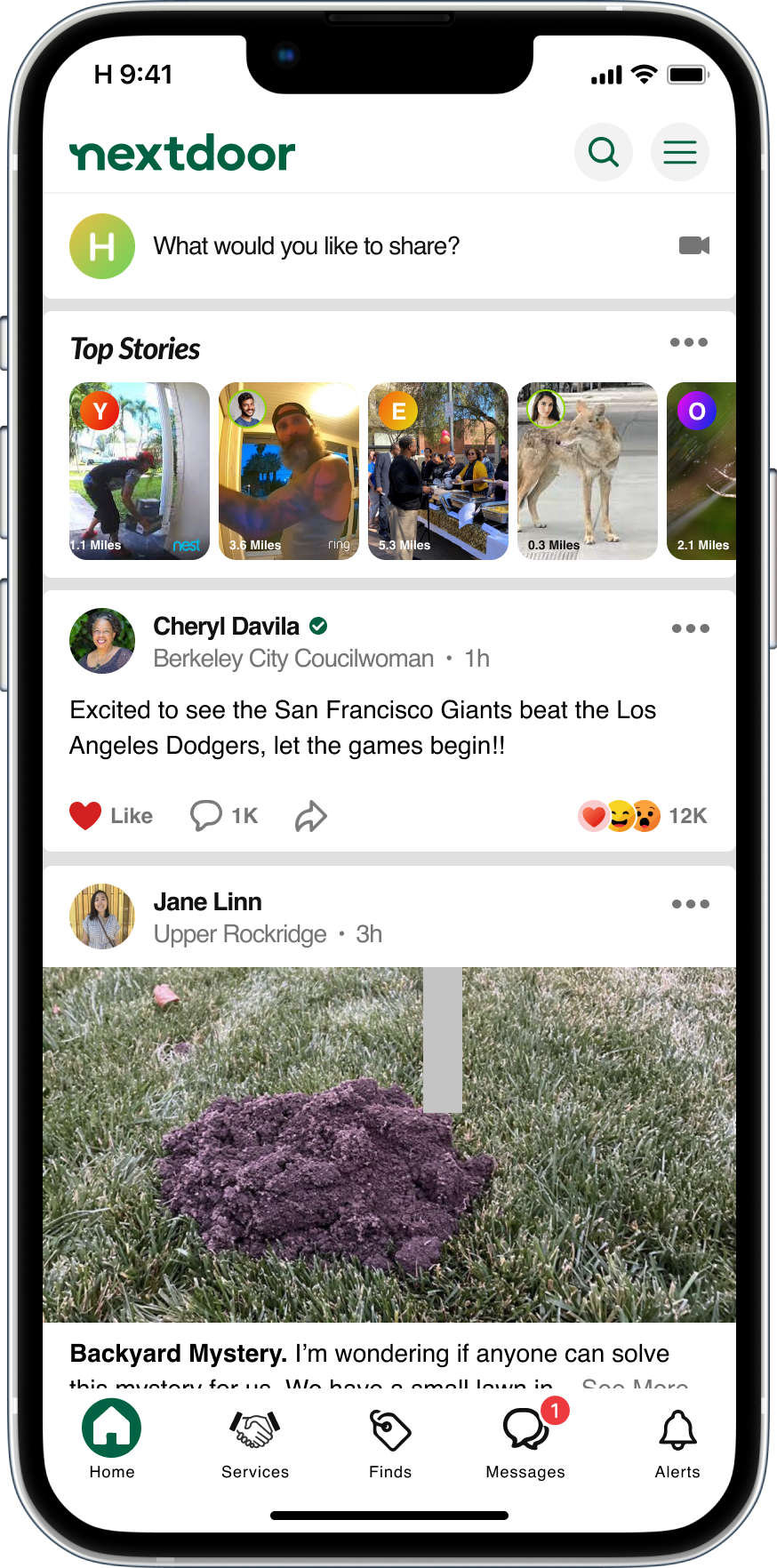
1. Header (Logo, Search, Menu)
Search definitely has hierarchical precedence, however I would not recommend the real estate afforded to it. Instead, in examining the header as entire segment of the screen, we are able to afford some real estate for branding, search and menu/account – consistent with the hierarchical standard.
I decided to include the logo for brand recognition. As a new company and changing the primary brand color, cementing recognition of the brand made it to the top the hierarchy list exercise. To manage the clutter issue, I decided to right-align two prominent actions: search and menu/account. This gives the user the ability to distinguish and easily access these primary actions in the header when needed. I also decided change the navigational structure. What was previously labeled as “More” and functioning as a Menu/Account action, has made its way to the top left. I moved messaging down to the action panel in primary navigation and I moved Connections to be within Alerts. The reasoning is that Alters and Connections really belong under one “Notifications” umbrella.
2. Create Post
As a social media platform and relatively new at that, I decided to give the Create Post action, formally a button, its own row directly below the header. This direction creates the notion for the user that it is welcome to share and a regular action between neighbors when given such prominence. When clicking into the “Create Post” area, it summons “Create Post” screen, which I thought was designed well by the team at Nextdoor.
Additionally, the “Create Post” area has a camera icon on the right. This is the introduction of a new “Stories” functionality introduced below.
3. Padding
One easy way to eliminate the clutter feeling when using the app, is to increase padding between cards or panels. Simply increasing the space attributes to well-distributed and easy to follow content.
4. Top Stories
Another opportunity for growth on Nextdoor is the introduction of Stories. Sure, stories are very well a part of other social media platforms, however on Nextdoor they can be neighborhood stories. The primary benefits of introducing Stories on Nextdoor are two-fold: (1) users are able to share and watch all types of activities in their neighborhood and surrounding areas, and (2) there is an opportunity to sync Nextdoor with digital alarm systems which allows users to notify their neighbors of activity on their digital surveillance feeds such as Ring, Nest, etc. From a business prospective, Nextdoor groups together the independent social feeds on these digital surveillance platforms and gives neighbors a heads up, all in one place.
5. Verified Users
Another business opportunity for Nextdoor is to introduce verified users. Nothing is more neighborly than being able to interact with your very own elected officials, such as city councilmen and councilwomen, directly on the app as representatives of the district you live in. Of course this needs some pretty smart rulesets to make sure that interactions are limited a reasonable middle ground.
6. Services
I’ve proposed relocating Groups to populate during in the feed and be accessible via the Menu/More screen. In place of Groups, I propose to add Services. Services seems to be a missing piece of the Nextdoor puzzle. Speaking form my own personal experience, I’ve looked to Nextdoor after recently moving for recommendations for essential home services. Service listings would prove to be a powerful addition to Nextdoor platform and unique place for all your neighborhood needs and recommendations.
7. Messaging
From a hierarchical prospective, messaging is definitely up there. It can easily be placed at the very top of the screen as Nextdoor’s current design suggests or at in the primary navigation panel. Being that Menu/Account action renders higher usability rate, I’ve decided to place that at the top of the screen and move messaging down, primarily the actions it holds. One could argue that the placement of these actions is interchangeable.
Services
Utilizing the Dark Cyan helps us improve accessibility as well as retain some brand recognition. The Dark Cyan can be used on white background and foreground. In this case study, my recommendation to Nextdoor would make Dark Cyan the primary color and Lawn Green the secondary color in the brand pallet for Nextdoor. Above are some examples of what this could look like.
1. Header (Logo, Search, Menu)
Search definitely has hierarchical precedence, however I would not recommend the real estate afforded to it. Instead, in examining the header as entire segment of the screen, we are able to afford some real estate for branding, search and menu/account – consistent with the hierarchical standard.
I decided to include the logo for brand recognition. As a new company and changing the primary brand color, cementing recognition of the brand made it to the top the hierarchy list exercise. To manage the clutter issue, I decided to right-align two prominent actions: search and menu/account. This gives the user the ability to distinguish and easily access these primary actions in the header when needed. I also decided change the navigational structure. What was previously labeled as “More” and functioning as a Menu/Account action, has made its way to the top left. I moved messaging down to the action panel in primary navigation and I moved Connections to be within Alerts. The reasoning is that Alters and Connections really belong under one “Notifications” umbrella.
2. Create Post
As a social media platform and relatively new at that, I decided to give the Create Post action, formally a button, its own row directly below the header. This direction creates the notion for the user that it is welcome to share and a regular action between neighbors when given such prominence. When clicking into the “Create Post” area, it summons “Create Post” screen, which I thought was designed well by the team at Nextdoor.
Additionally, the “Create Post” area has a camera icon on the right. This is the introduction of a new “Stories” functionality introduced below.
3. Padding
One easy way to eliminate the clutter feeling when using the app, is to increase padding between cards or panels. Simply increasing the space attributes to well-distributed and easy to follow content.
4. Top Stories
Another opportunity for growth on Nextdoor is the introduction of Stories. Sure, stories are very well a part of other social media platforms, however on Nextdoor they can be neighborhood stories. The primary benefits of introducing Stories on Nextdoor are two-fold: (1) users are able to share and watch all types of activities in their neighborhood and surrounding areas, and (2) there is an opportunity to sync Nextdoor with digital alarm systems which allows users to notify their neighbors of activity on their digital surveillance feeds such as Ring, Nest, etc. From a business prospective, Nextdoor groups together the independent social feeds on these digital surveillance platforms and gives neighbors a heads up, all in one place.
5. Verified Users
Another business opportunity for Nextdoor is to introduce verified users. Nothing is more neighborly than being able to interact with your very own elected officials, such as city councilmen and councilwomen, directly on the app as representatives of the district you live in. Of course this needs some pretty smart rulesets to make sure that interactions are limited a reasonable middle ground.
6. Services
I’ve proposed relocating Groups to populate during in the feed and be accessible via the Menu/More screen. In place of Groups, I propose to add Services. Services seems to be a missing piece of the Nextdoor puzzle. Speaking form my own personal experience, I’ve looked to Nextdoor after recently moving for recommendations for essential home services. Service listings would prove to be a powerful addition to Nextdoor platform and unique place for all your neighborhood needs and recommendations.
7. Messaging
From a hierarchical prospective, messaging is definitely up there. It can easily be placed at the very top of the screen as Nextdoor’s current design suggests or at in the primary navigation panel. Being that Menu/Account action renders higher usability rate, I’ve decided to place that at the top of the screen and move messaging down, primarily the actions it holds. One could argue that the placement of these actions is interchangeable.


