AI-Enabled Recruitment Platform
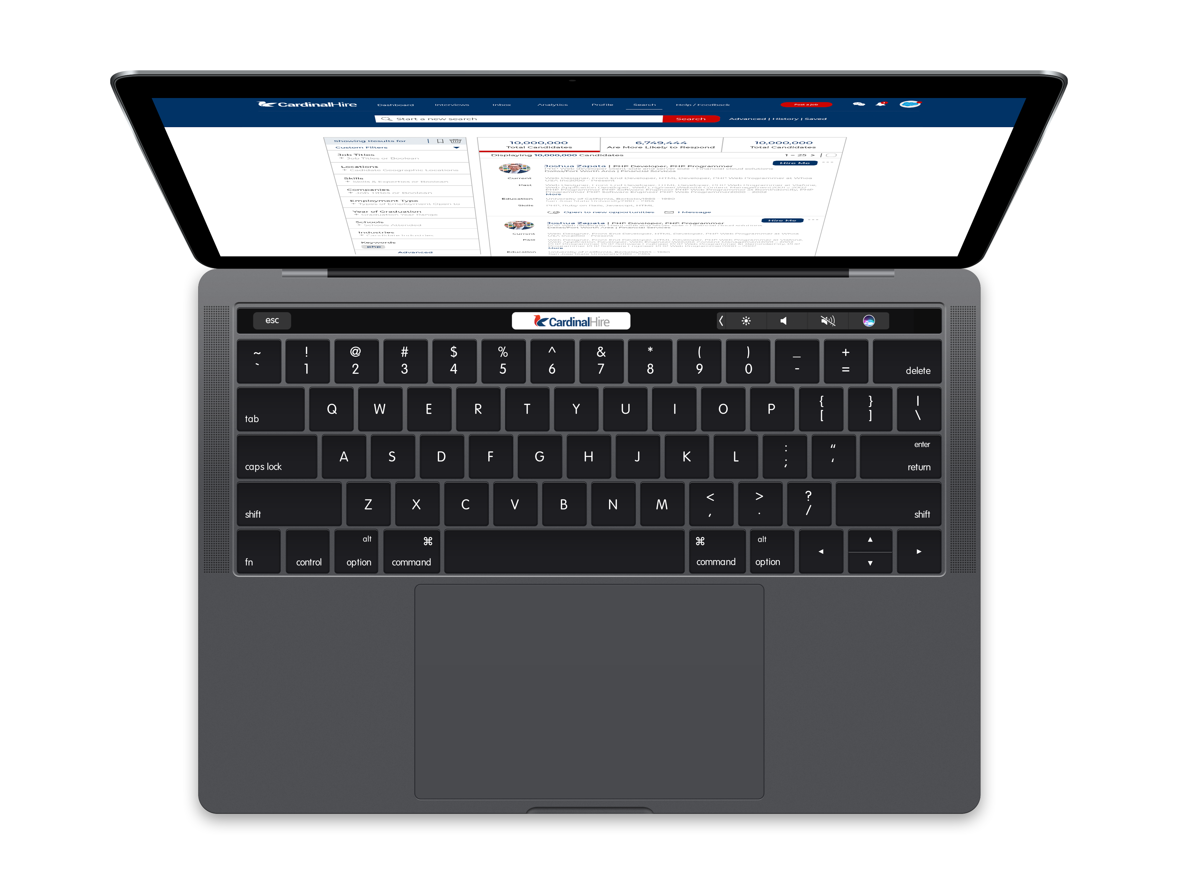
CardinalHire is a talent marketplace that matches top tech talent with top tech companies and startups. Users on the Cardinal Hire platform receive personalized guidance throughout the hiring process from a dedicated Talent Manager. Employers get access to a hand-picked pool of leading candidates, as well as access to unmatched applicants and competing offers so they can recruit and hire with insight. CardinalHire ensures efficiency for employers by paying endorsed candidates to interview and test with their company, simultaneously empowering jobseekers.
- Product Design
- Design System
- Branding
Tools
- Sketch
- Adobe CC
- Clubhouse
Employed
January 2018 – June 2019
Product Design
As a recent employee and alumni of the University of California, Berkeley, I decided to shift gears and develop further my skills outside of the academic industry. Since I was employed at Cal, I wasn’t gung-ho about securing an entry-level position upon graduating. When I decided it was time to move on, I found that even with a prestigious Cal degree and solid initial experience as a Product Designer, acquiring an offer to work at top-tier tech companies was immensely competitive.
Though confident in my skills as a designer, I couldn’t get any hiring managers to even look at my resume. More often than not, I was sent an auto-generated response from a resume processing system.
In my search of ways to get a real person to look at my resume, I was approached by Paul Campbell, the future CEO of what is now CardinalHire. Paul was also a Cal alumnus and he had also attended Stanford. I had met him at a Cal career fair where he was recruiting students for his ride-sharing startup. Though his initial company had failed, he decided to try to tackle another problem, recruitment. CardinalHire had spun out of the Uber-like recruitment platform and he was looking to formulate the initial team for this new product.
Intrigued by a generous equity package destined by the chances of success, I agreed to join CardinalHire as a founding member.
Problem
Muck like my experience searching for quality employment had been, the saturated job market is full of pain-points for talent and recruiters alike. Jobseekers that don’t follow a specific formula or have a branded resume are not likely to have a recruiter even look at their resume, although they may be a perfect fit for an open role. Similarly, recruiters have to jump through hoops to place the quality and ideal talent for their open roles.
My role at CardinalHire started with user research, gathering data, and conducted studies. Some of the questions I was looking to answer were:
- How can technology help pre-qualify candidates for a unique position? Can machine learning and AI help solve this problem? If so, how?
- What elements of the search, application, and hiring process are most painful for talent and recruiters alike?
- Is it possible to build a platform that addresses the needs and experiences of both users?
Aside from the challenges of the research, the engineers who were laying down the framework for the application had originally put forth the below experience. I knew I had my work cut out for me, in research and design.
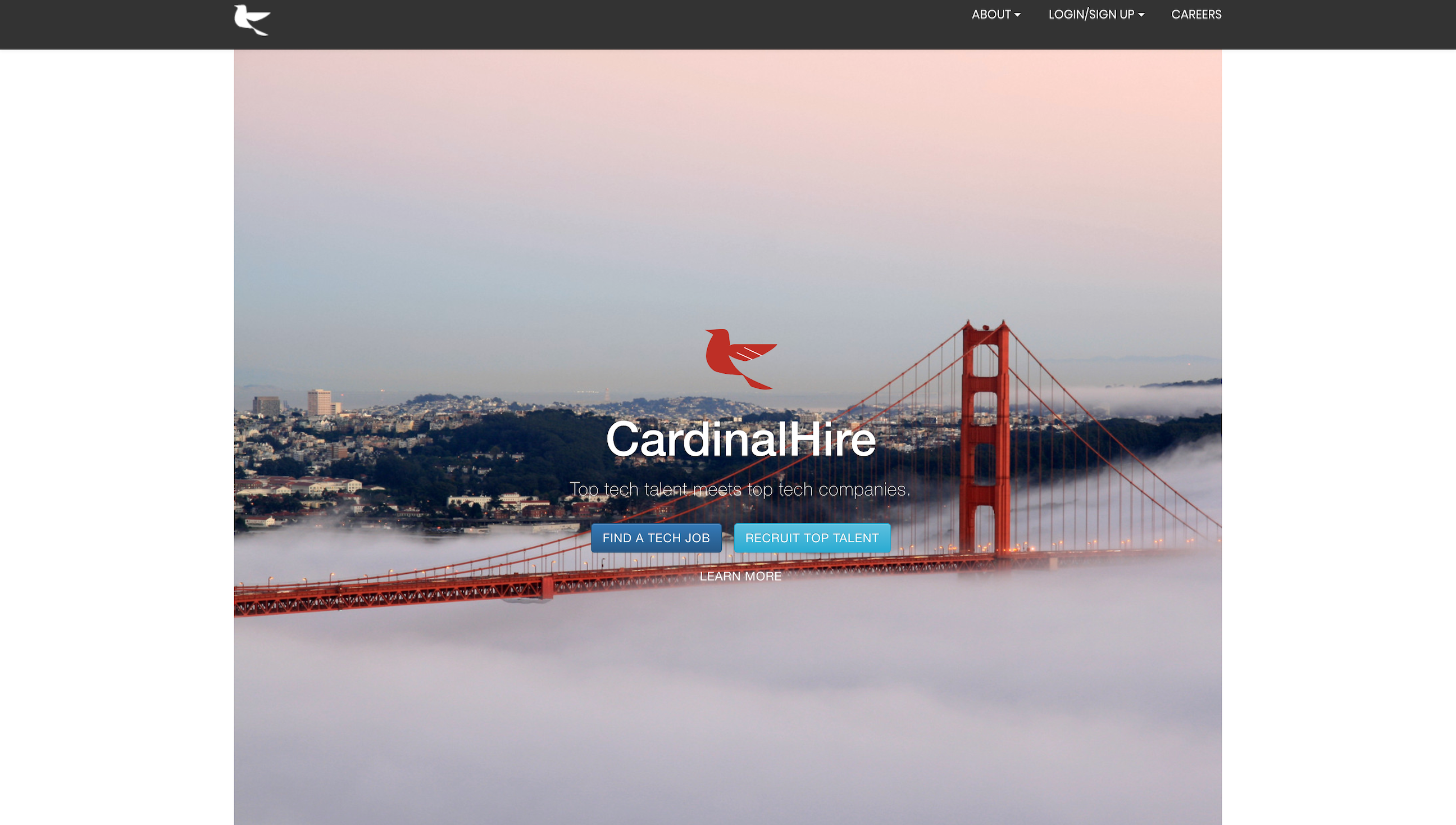
Though not at all pretty, the screenshot of CardinalHire showcases the initial state upon my joining the company. Paul had hired only one engineer so far and was looking to secure a few more hires, primarily machine learning and front-end engineers. He and I were to serve as intermediary PMs. After all that is the nature of a new startup, stakeholders tend to wear multiple hats to see their product to success.
The aesthetic of the app developed, although not pretty addressed the major requirements of the predetermined functionality which allowed me some time to extract the data that will drive the product forward and incorporate it in a redesign.
Research
In setting out on the journey to build a platform that responds to the needs of users, we must first discover who they are and what they want us to build. Then we can dive into why they want it and how can we build it.
These are the fundamentals of the user research process. The answers to these questions save company resources, especially relevant to a new company seeking to enter a competitive market.
Who
Primarily, CardinalHire had two user roles in mind, talent seeking a new position and recruiter seeking the perfect candidate. Both parties are essentially out to find one another, however, the process by which the two are able to discover one another remains a hurdle in many ways. One step towards solving this problem is understanding who these users are.
Jobseekers
Jobseekers come in a wide spectrum of characteristics and have diverse profiles of experience and education. Since CardinalHire focuses solely on tech, our standard persona for a talent seeking a new position takes shape pretty well.
-
- Jobseekers usually seek a new position when they feel time to leave their company. While some jobseekers may be unemployed at the time of attempting to secure the next chapter in their career, for whatever reason, we’ve found that most talent attempt to secure a new position prior to fully leaving their most current position.
- Jobseekers rarely switch roles in their career. It does happen, however, when it does it’s usually in the beginning – part of the discovery phase that embodies every career process. This does not include talent that may refine or grow into a position from a certain field. For example, a UX designer that decides to pursue Product Design.
- Jobseekers are creative and intuitive in finding new roles, they understand how to navigate professional mediums and present their skillset in an attractive manner. However, we’ve learned that this is a discovery process. Jobseekers will spend a long time interviewing and perfecting their profile, learning from failed attempts as they go. A coaching tool or checklist to minimize initial mistakes could greatly help narrow this gap
To understand jobseekers, we’ve conducted numerous surveys and interviews. Below are some of our findings.
Where do talent seek work?
How many years of experience?
What is their education level?
Recruiters
Recruiters are expert fishermen and women. They must understand what type of fish they are looking for, maturity, where to look for them, and how to find them. A great analogy is like the TV show “The Big Catch,” once you know what you’re looking for, where to find them, and how to extract the desired fish, it becomes a matter of finding the perfect specimen. However, the tools at hand often depend on the company they’re working for. You can assume that larger companies may have a much more organized infrastructure for recruiters where smaller companies tend to be more scrappy and likewise require the same form level of scrappiness from their appointed recruiters. Defining the standard recruiter person was much like that of talent since we focusing on tech.
-
- Jobseekers usually seek a new position when they feel time to leave their company. While some jobseekers may be unemployed at the time of attempting to secure the next chapter in their career, for whatever reason, we’ve found that most talent attempt to secure a new position prior to fully leaving their most current position.
- Jobseekers rarely switch roles in their career. It does happen, however, when it does it’s usually in the beginning – part of the discovery phase that embodies every career process. This does not include talent that may refine or grow into a position from a certain field. For example, a UX designer that decides to pursue Product Design.
- Jobseekers are creative and intuitive in finding new roles, they understand how to navigate professional mediums and present their skillset in an attractive manner. However, we’ve learned that this is a discovery process. Jobseekers will spend a long time interviewing and perfecting their profile, learning from failed attempts as they go. A coaching tool or checklist to minimize initial mistakes could greatly help narrow this gap
To understand recuriters, we’ve conducted numerous surveys and interviews. Below are some of our findings.
Where do recuriters find talent?
What is their company's size?
What mediums do recuriters use?
What
To determine our focus, I first had to break down the dense definition of the problem I was looking to solve from Forrest’s email. You can imagine the sheer magnitude of questions that came thereafter. Not only was I new to the company, but the task at hand was rather vast in scope.
- ✅ A Smart Talent Profil
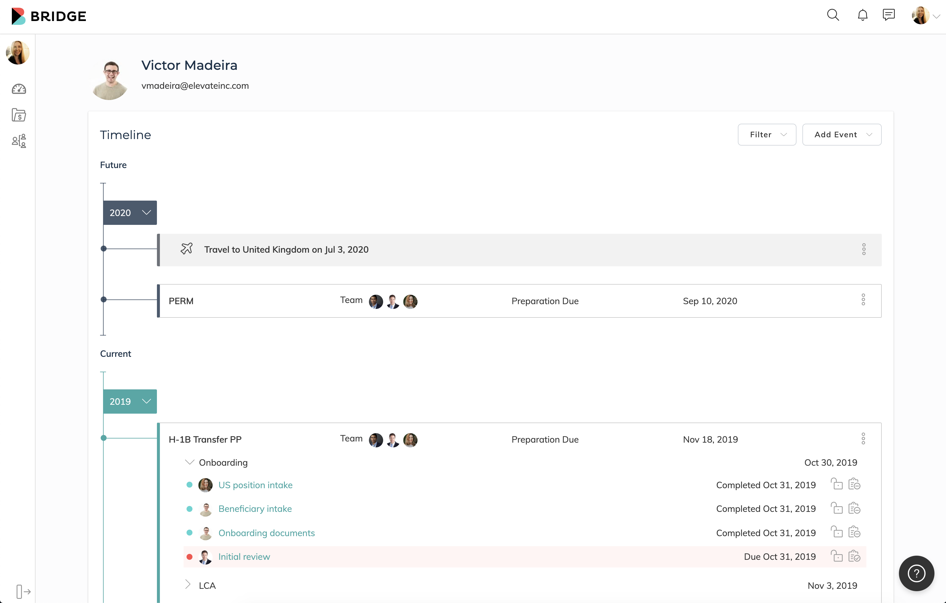
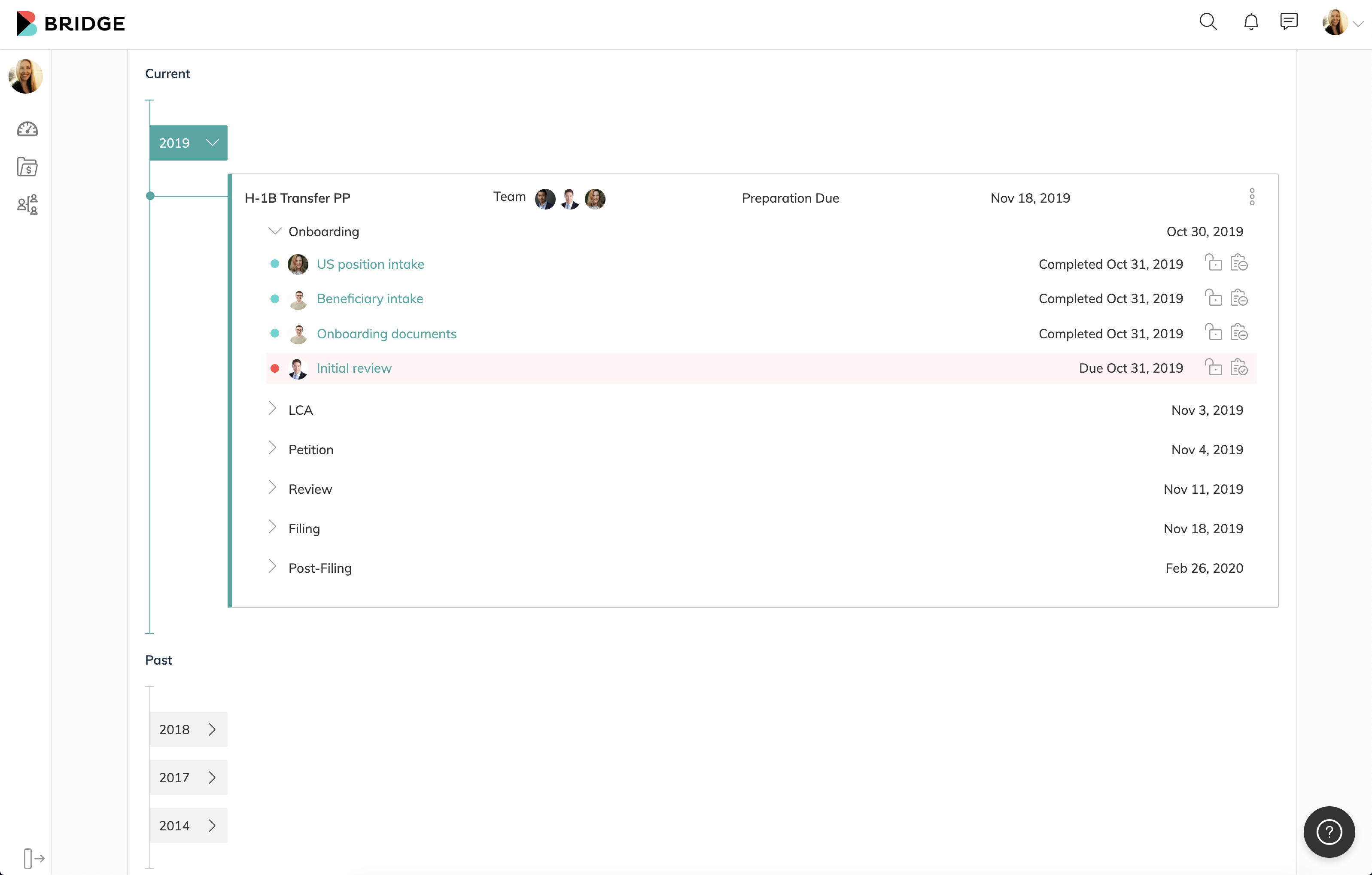
- ✅ A timeline that includes current, past, and future events.
- ✅ Introduction of Reminders
- ✅ Date Driven Organization and Consistency
- ✅ Better Usability
- ✅ A Recruiting Platform
- ✅ A timeline that includes current, past, and future events.
- ✅ Introduction of Reminders
- ✅ Date Driven Organization and Consistency
- ✅ Better Usability
How
Once I unraveled the “what” from the defined problem, coupled with the understanding of “who” the users are, I was able to start contemplating how it can be done.
This process normally more in the creative process, however, there was a structural inconsistency in the Stakeholders’ vision and the reality of the product. On the one hand, the previous timeline was heavily centered around the application and on the other, we wanted to add more ‘events’ to it.
Utilizing a mindmap, I discovered that structure of the previous timeline had a major hierarchical problem, and that was that the epicenter of the platform’s design was actually not supposed to be centered around the application, but rather the International Employee. I discovered that every element of the Bridge platform and processes always point back to the International Employee.
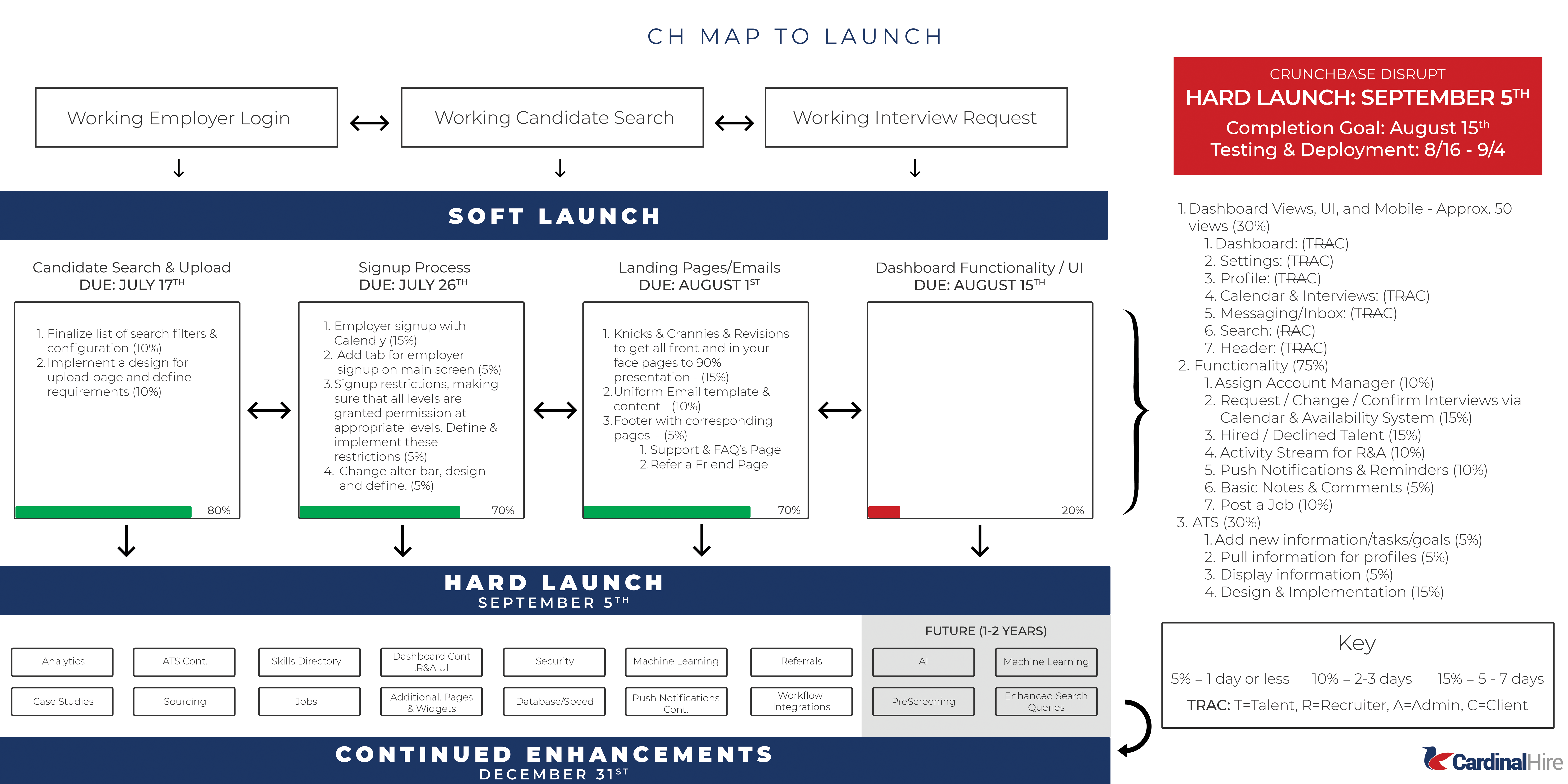
Another major flaw that Forrest’s email was alluding to was the previous interface’s experience. Forrest mentioned that he suspects that users are not utilizing the timeline as expected and hardly clicking into milestones within the timeline to reveal tasks.
In my analysis of this problem, I discovered that international employees hardly had tasks to contribute to the overall application. If you take all the tasks required to successfully complete an application, though each application differs, the approximate total share in the workload of an application is 20% for the international employee. Their role is solely to provide information and prove their elegibility. Therefore, the application interface is not really meant for their user-role, we would provide access to the process to adhere to one of Bridge’s core values. transparency.
Another important finding hindering the overall experience and usability of the platform was the overwhelming legal terminology used. While Bridge is a legal tech product, we weren’t doing a good job of isolating the user from terminology complexities and making it easier for them. One immediate way to do this was to translate what some of the confusing terms actually mean. For example, foreign nationals mean employees, and matters mean applications. There was no reason to actually use government terminology other than please lawyers, yet they as we do serve immigrants and that should remain the focus.
Though I did not speak of everything we worked on to get to the first iteration, these were highlights and turning points for Bridge. They are what shaped this application’s growth trajectory for the long run.
Why
The most important part of any proposed solution will always be the whys. Design decisions are ultimately proposals and proposals like everything else in the professional world must embody a value. In our case, we ask ourselves, does the proposed direction translate well the business goals to experience, and is the best imminent way forward, allowing growth and better usability?
Well, yes it does. As the hierarchical mapping illustrates, applications are not on top of the food chain, rather it is the International Employee. The International Employee is centered around all the work Bridge does and likewise is the argument for the platform. If we focus on any other user role and base our design decisions on them, this would platform would shift from the slated business goals and broader vision defined by Bridge’s Stakeholders.
Now that we understand why we focus on the International Employee user-role as a base for our design decisions, we must also understand the why behind our strategy to build an experience worthy of the slated business goals. Our underlying strategy is to create a profile page for the IE user.
Our business goals state that we want to create a timeline that can house a broad range of events, from applications to informational sections. Also, to introduce reminders and tasks module. This user experience allows to better solve the problems stated by Forrest in respect to better usability and experience, better process transparency, and data-driven organization and consistency because the entire realm of the platform shifts in focus.
Solution
One of the most important phases of product design is actually done before the design process even starts. Before you start building a product, you need to understand its context for existence. It’s the time when the product team must define the product vision and product strategy.
In this case, we have business goals and a problem defined and they were directly handed down by the CTO of the company. Stakeholders at Bridge we profound in the defining direction and vision for the company. From the onstart, we knew where we wanted to go, it was only a matter of getting there.
We needed context and a strategy to make the vision reality.
Beyond
The introduction of the Immigration History Profile & Timeline was the very first large project I owned working at Bridge. Thereon, we accomplished slue of larger projects with one larger vision in mind: the Bridge Immigration Platform.
User Dashboard for HR Representatives, Client Services & Attorneys
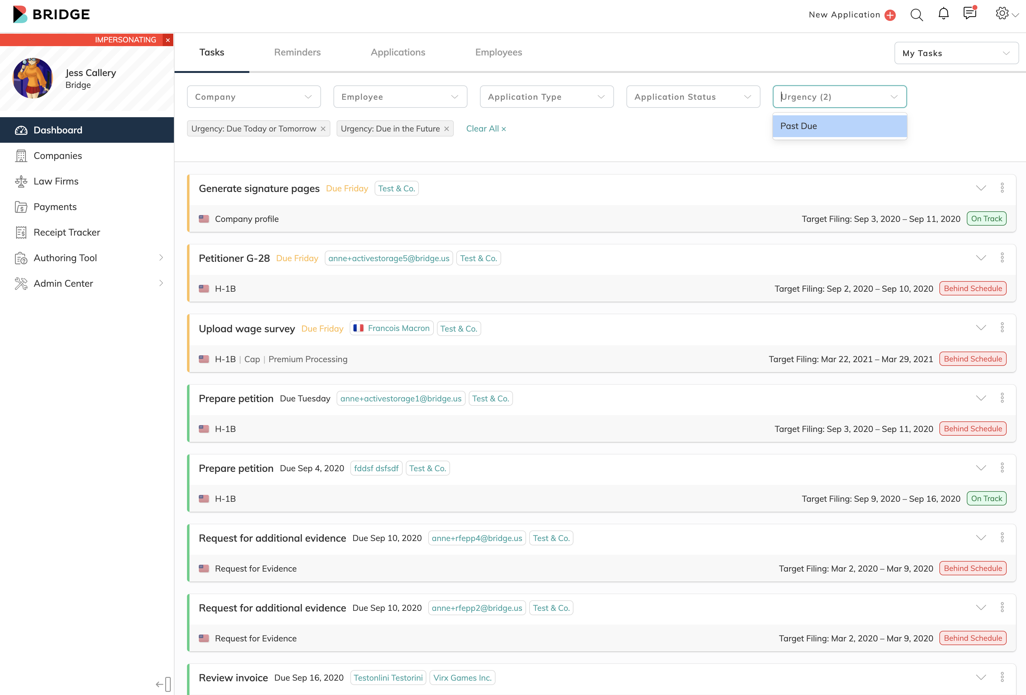
The Client Services Team are Bridge employees, they oversee every application and play a crucial role in the product. The Client Services Team is the face of Bridge and they work very closely with all the other users on Bridge – HR Representatives, the Legal Team, and International Employees – dubbed admin users.
The platform’s admins oversee the application processes and ultimately the ones who ensure timely and accurate application submissions on the Bridge platform, not only on behalf of International Employees but also the company that is looking to hire them. Their day-to-day workflow is centered around the complex, nitty-gritty processes for applicati0ns and companies. They are the gatekeepers, they are responsible for successfully processing applications and monitoring that application deadlines are met. It was of the utmost importance that the next wave of upcoming available resources was dedicated to enhancing admin users’ experience.
Being that admin users’ day-to-day workflow revolves around processing time-restraint tasks. It was important to produce a dashboard that was unique to their key jobs, allowing the users to effectively track, complete and schedule tasks.
Strategy & Immigration Guidelines
While our Client Services team is an in-house team at Bridge and Attorneys are partner law firms, HR Representatives are users whose company is an acquired client that look to Bridge as a solution for a slue of frustrations within the immigration process. HR Representatives are users who use Bridge to make it easy to acquire foreign talent, manage their applications, and ensure the talents’ tenure at the company.
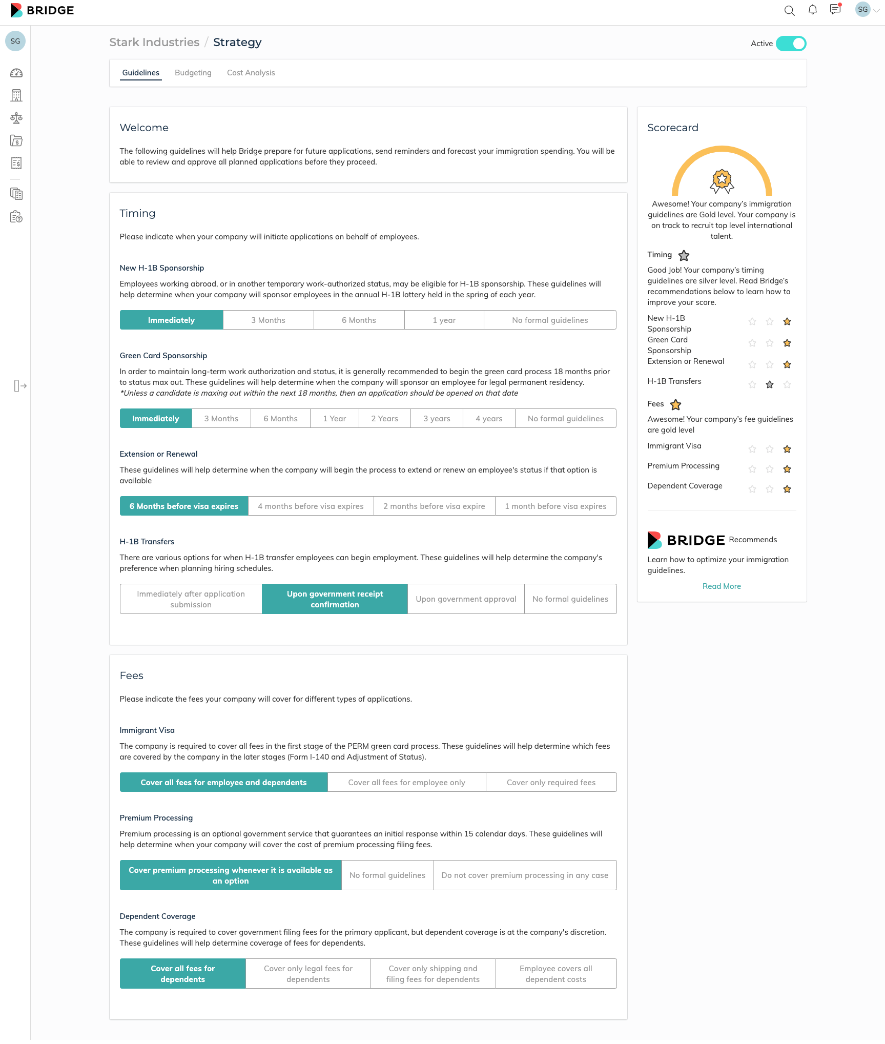
Strategy and Immigration Guidelines are bundled tools for HR Representatives and in general, companies that help them achieve their hiring needs. Immigration Guidelines allow HR Representatives to set up guidelines for their employees in regards to fees, renewals, and green card applications – allowing users to projet applications and process them according to what makes the most sense for their employees and the company. Additionally, the setting up of these guidelines allows the Bridge app to project future applications so that they are kicked off automatically customized to the employee’s needs and allows companies to measure all open and projected application types. In conjunction, Strategy works with Immigration Guidelines to budget and access a cost analysis tailored to the company’s immigration program. These tools geared towards improving a rigorous process of immigration projection help HR representatives do their work smarter and more efficiently work. Prior to this initiative, HR Representatives were tracking these metics and plans in an excel spreadsheet. These kinds of tools are virtually unavailable on the market for immigration. Our success lies in identifying these pain points and producing the technology the poses the solution. This one way how Bridges has become the immigration hub for employers.
Invoicing
The Product Team also took the time to build out a robust invoicing system for Bridge users. Invoicing helped solve another frustration in the immigration process. Invoicing helps keep billing automated and efficient.
Billing Procedures:
-
- Employees billed for the portion of their application fees (depending on the Company’s Immigration Guidelines)
- Company’s billed by Bridge per application for application-related fees
- Attorney Partners billing Bridge for their application-related fees
Our invoicing made billing automated depending on application parameters and company guidelines. In addition, a dashboard was constructed to organize this information. Companies can automatically approve certain types of invoices and manually pay others. They could also keep track of what’s paid, what’s upcoming, and what is due. Additionally, they are able to access history to access costs per employee, division, and duration.


